In the final year of my BFA at the University of Illinois, we welcomed in the Siebel Center for Design headed by Rachel Switzky from IDEO. This new design team of diverse backgrounds quickly made a huge impact on and beyond the campus. They facilitated multidisciplinary learning, teaching by doing, student and instructor engagement, and communicated the impact of design thinking in all forms of learning.
They needed a strong, consistent visual presence that would be as memorable as they were to work with. I was hired as their first graphic designer and solely dedicated to updating their visual identity and helping build their brand. Through my research and interaction with them, I developed a wide variety of fun, playful colors to choose from, with a smart-looking, minimalist approach to its execution.
Design Software
Illustrator, InDesign, Adobe Xd
*Note: Photography sourced from Unsplash website.
Contents Below
Logo and Color Palette
Website Design (with a walkthrough video)
2019 Annual Report (printed booklet, select pages)
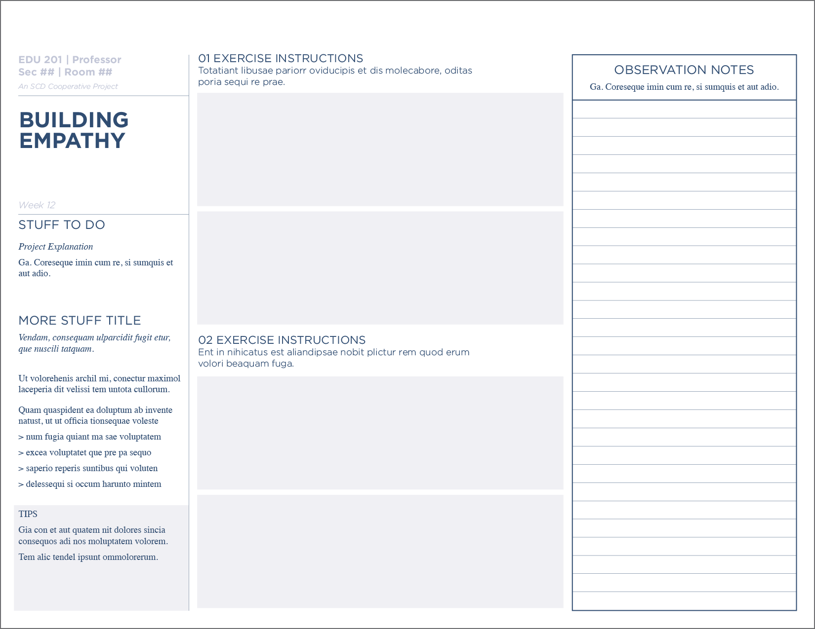
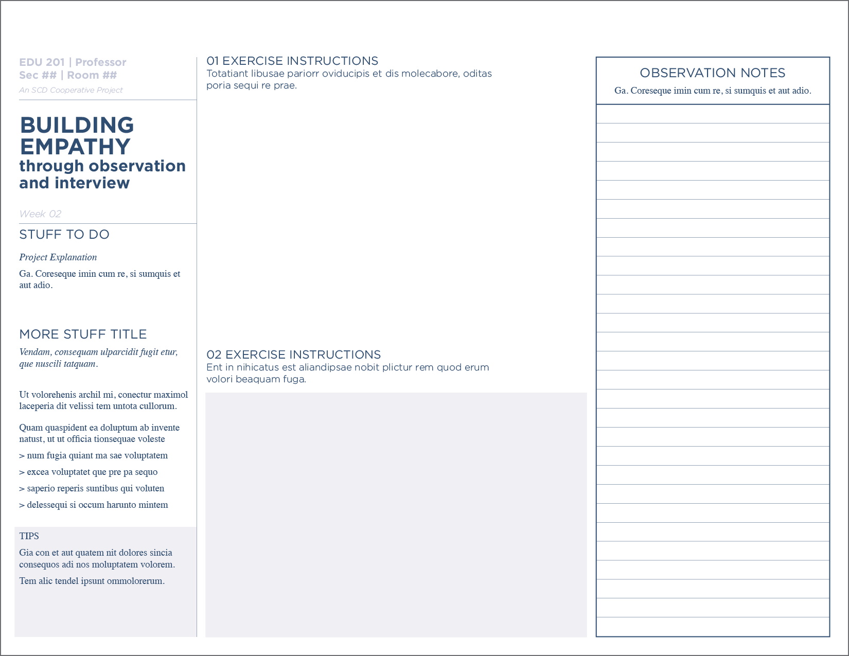
Template Designs, for Partner Courses with SCD at the university
Research and Discovery – company analysis before logo work
Logo and Color Palette
SCD required a logo that reflected their energy and aesthetic. The flexibility in their new logo played into their bold and fun personality, yet was serious enough when a professional approach was necessary.


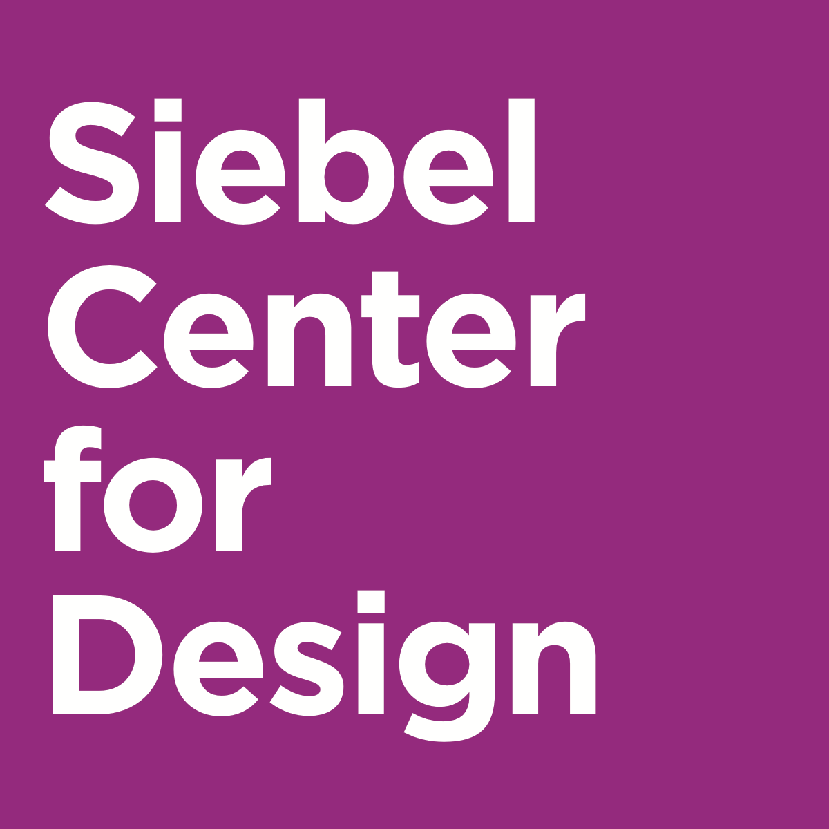
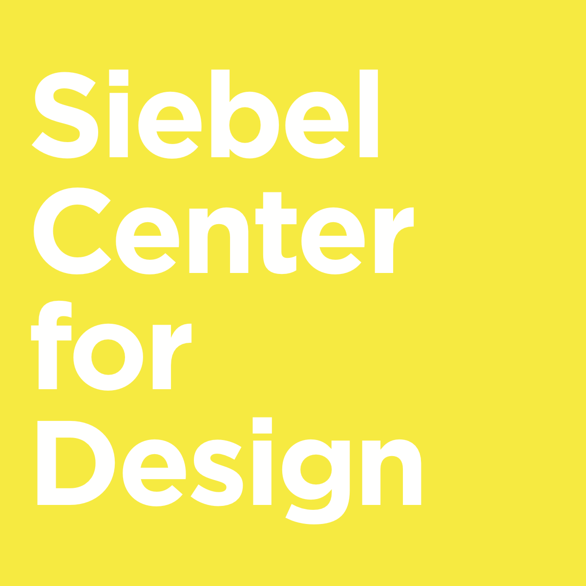
SCD’s new color palette began with the UofI color system and branches from there with strong complimenting colors in their Primary Palette, and more subtle colors for range and depth in their Secondary Palette.
With a loose guideline of instructions and a bold, serious design, I knew that future designers for the SCD brand would have the structure yet flexibility needed to keep SCD looking both serious and playful.
Website Design
As an innovative "teach-by-doing" group of designers, SCD's website needed to reflect their outreach methodologies. Through research on current web design trends in SCD’s area of work, I approached the website’s design with their direct and confident voice in mind and their overall approach to fun!
The final design is fresh and bold (making use of bright, large images + white space), with a smart look—utilizing a faux-grid as a design element.
Web Design Walkthrough
Website, Full Page Examples
2019 Annual Report
By the end of my time with SCD, I designed their first ever annual report, highlighting the previous year’s events, business, experiences and accomplishments. They wanted a tangible informational piece to share with their partners and colleagues across the university.
From the arrival of their first booklet, the excitement never stopped and in no time our stacks of books were shrinking. It seemed everyone who had worked with SCD wanted a booklet!
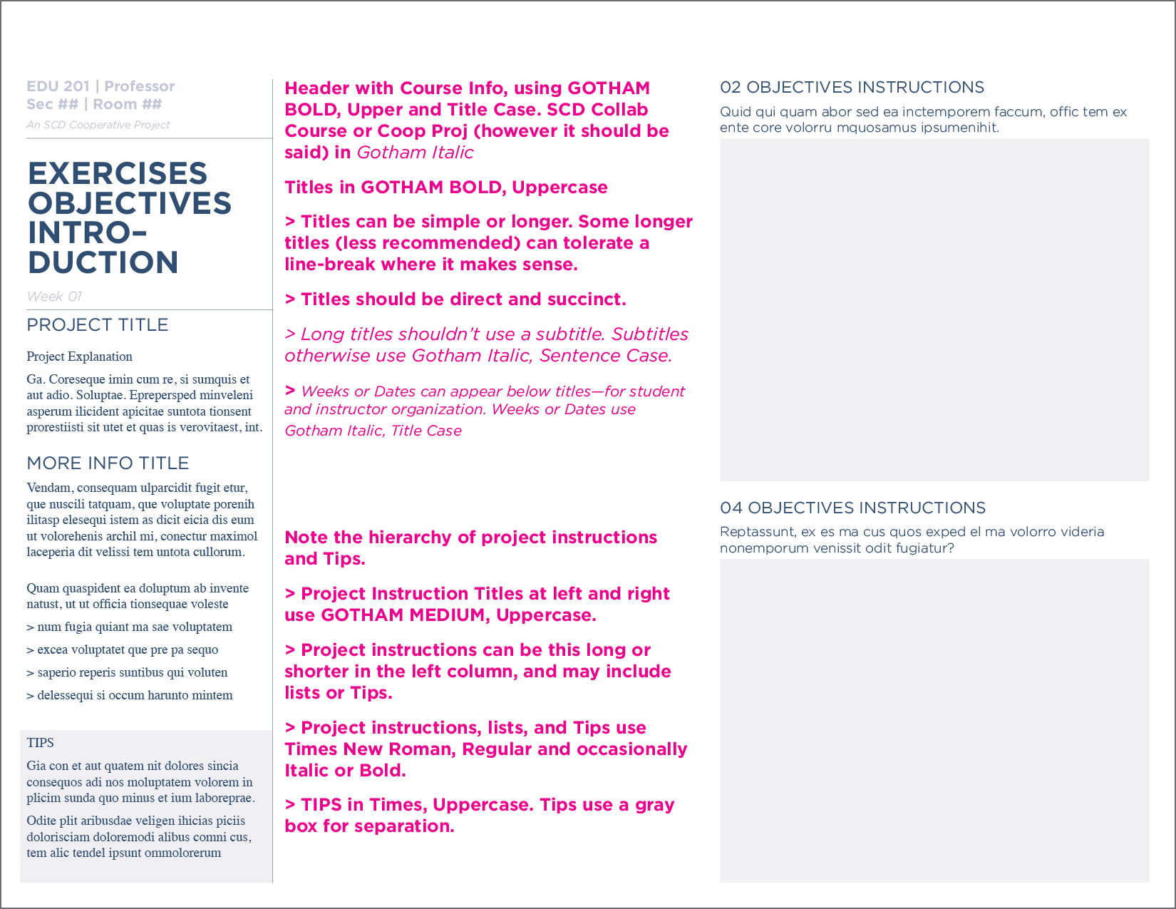
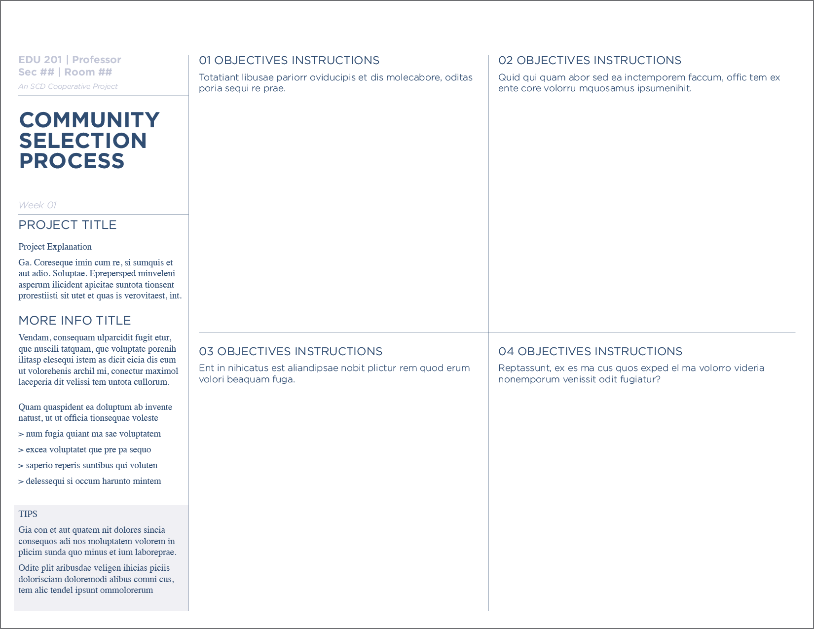
Instructional Templates for SCD Partner Courses
Part of SCD's plan to spread design-thinking was to engage with instructors whom they invited to learn SCD's instruction-by-design approach and then emulate it for their courses.
With the opportunity to help build SCD's instructional toolkit, I created templates (below) to guide the layout, grid use, color scheme, and text structure for their future designers. It was a fun challenge for a text heavy project, as I love working with type and gridded layouts.

Research and Discovery
Before making big changes, I took time to understand what stage their branding was at. Below is a snippet from my Benchmark Analysis—a research technique I used to assess their organization’s presence.
Using what I learned from research and team communication about what they liked about their brand, and what they wanted changed, I developed their logo, type and color palette, and several of their materials (seen below) before I graduated.